

10 September, 2020
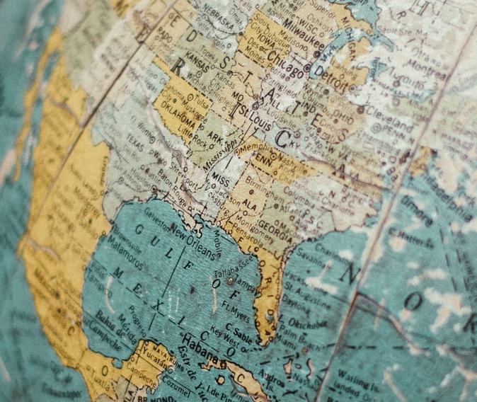
Throughout the COVID-19 pandemic, many of us have become transfixed by maps and live dashboards displaying rising global cases and spread. The red and black dots showing cumulative cases have become a reminder of the importance of maps in our everyday lives and the subtle, and also not so subtle, ways that data visualisation can influence our thinking.
Similarly, over the years, our understanding and behavioural response to many different issues has been profoundly influenced by maps and data visualisation. An example – the maps typically used to depict migration routes often show big red arrows aggressively pointing towards Europe, representing irregular migrants on their way to the EU.
Though these maps may look informative, a professor of political geography, Henk van Houtum, and journalist Maite Vermeule say that these data visualisations are actually anything but neutral.
In a fascinating article for The Correspondent, they have highlighted that traditional maps may not be the best format for conveying information on migration and that we need to look at maps differently to really understand the context behind them. Ideas for ways we could create new, innovative maps include asking migrants to draw their own map of their journeys, or showing conflicts on the map, or even incorporating images and sounds to show the reality of migration.
That’s not to say maps don’t serve a purpose. As the COVID-19 dashboards indicate, maps can definitely help people to make a connection and visualise real-world phenomena, such as infectious diseases. But when we view these maps, we also need to be aware that these visualisations aren’t always neutral. We need to ask ourselves what we see – but, above all, what we don’t see.
By Gemma Coate