Weekly Short

25 March, 2021
From tracking European colonisation to locating ancient Egyptian tombs, maps reveal a lot about our past. But can they also chart the course of the future?
Last week brought the news that certain historically deprived neighbourhoods in the US are at a much higher risk of flooding than in more affluent areas. Their populations are also at higher risk of asthma, lead exposure, traffic fatalities and a host of other threats.
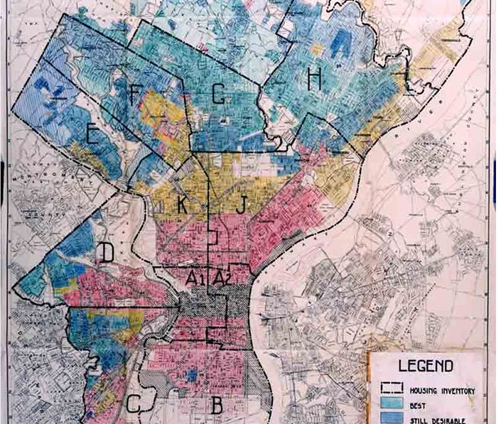
So, why is this the case? A major factor is the US federal government’s practice of “redlining” in the 1930s: creating colour-coded maps outlining which neighbourhoods in a city were and weren’t “safe” to insure for home loans. Areas denied mortgage insurance were coloured red (hence the name). And the biggest factor for determining which neighbourhoods would be redlined was the high presence of ethnic minorities, particularly African-Americans.
As a result of this federal neglect, redlined areas were also overlooked for business development and housing renovations, as well as investments in sewers, levees and other infrastructure that could have reduced public health risks. And the consequences of these maps for racial inequality and segregation still endure today – as the latest flooding data shows.
In the same week that the UK Government urged citizens to plug their housing, employment and ethnic data into the 2021 census, how can organisations use this information to redress, not perpetuate, inequality? One answer is careful consideration of where you choose to establish operations, services and community investment activity. The 1930s’ redlined maps show the power of data to not just predict, but determine, a community’s future. It’s essential to use that power wisely.
By Sarah Howden